29LT Zarid

29Letters (29LT) is a digital type foundry based in Madrid, Spain, specializing in developing multilingual typefaces. Led by Pascal Zoghbi, 29LT focuses on the typographic relationships between Arabic and Latin scripts.
Zarid Serif
In 2017, I was commissioned by Pascal to draw the Latin italic for Zarid Serif. Originally designed as a headline typeface for the Dubai newspaper “Emirates Today”, Pascal had subsequently revised and expanded the typeface several times and now saw the need for a true Latin italic. Since the term “italic” does not exist in Arabic typography and calligraphy, we agreed on the name “slanted”, even though the characters are not merely slanted, but redrawn with a handwritten feel.

I took care to preserve the spirit of the existing characters, both Latin and Arabic, to integrate the Latin Slanted as well as possible. Following the example of the Arabic Slanted, I simplified the forms, rounded some corners, and added a typical cursive flow. However, many style-defining elements have been preserved, such as the sharp cuts and the diamond-shaped dots.

Zarid Sans
While working on Zarid Serif or, possibly, even earlier, Pascal developed the idea of adding more variants to Zarid and expanding it into a complex type system. So, it was not surprising that after finishing Zarid Serif, he asked me to help him with the Latin part of Zarid Sans.

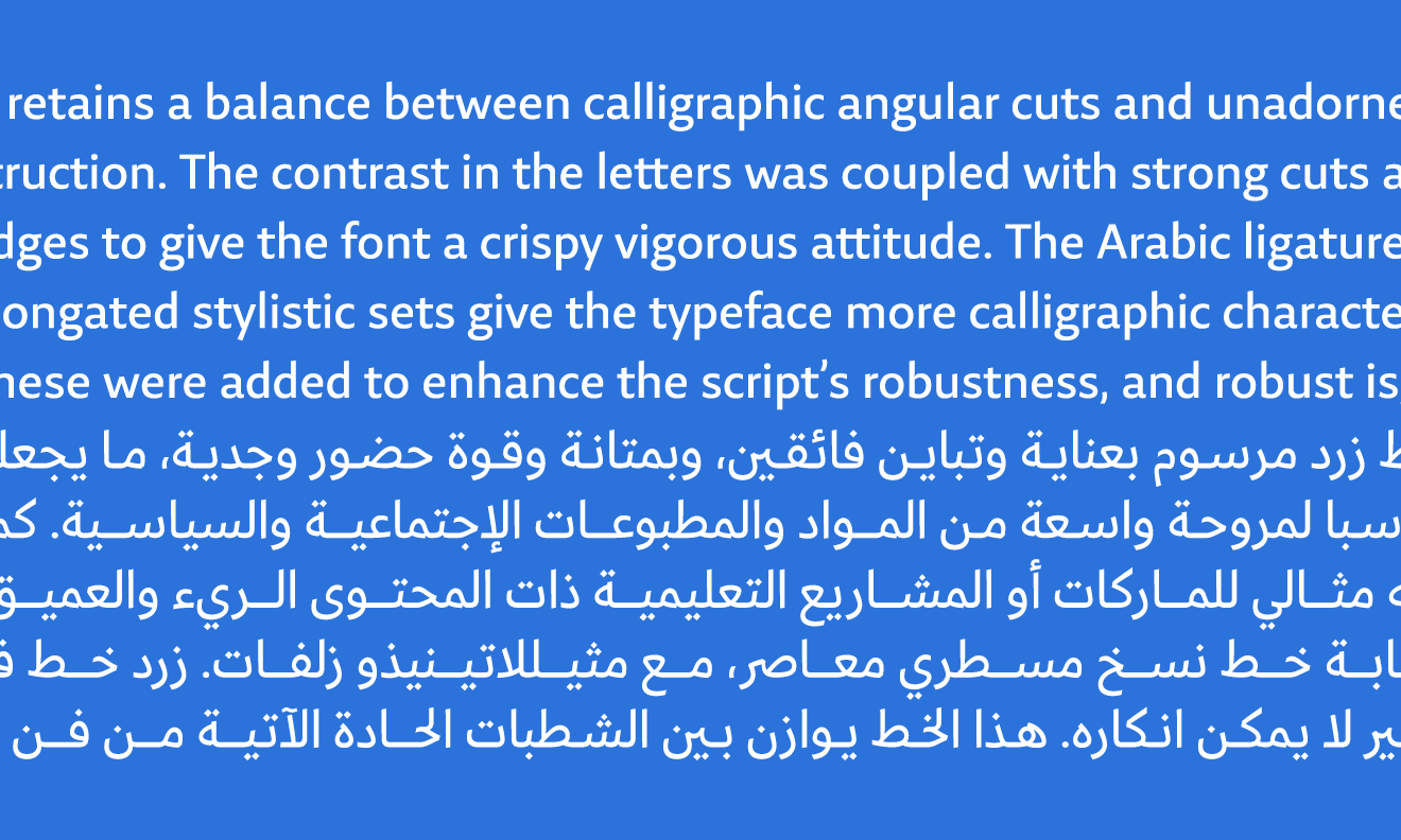
Thus, I developed a sans out of Zarid Serif by removing the serifs, reducing the stroke contrast, changing the proportions and spacing, and edited the kerning. In Arabic, there are no serifs to remove. Instead, Pascal had to tone down the distinct calligraphic style, remove many of the sharp edges and notches, and change letter connections and spacing. We worked simultaneously, sending font files and PDFs back and forth to each other over and over again. We compared them extensively to make sure that Arabic and Latin would play well together.

The result is a friendly yet formal, well-readable typeface, ideally suited for long passages of text. It speaks the same language as Zarid Serif but has its own structure and character.
Zarid Slab
Shortly thereafter, Pascal took the characters of Zarid Sans and modified them again. He further simplified the forms, reduced the stroke contrast almost to monolinearity, and removed the calligraphic influence almost completely. Together we thought about what a Latin counterpart to this might look like. We could have gone in the direction of a Swiss-influenced Grotesque but decided on a Slab with geometric nuances. This would fit better into the Zarid family and would enrich it with an interesting and useful variant.

Based on this, I drew the Latin part of Zarid Slab. To keep everything in continuity, I always had to look back and forth between Zarid Sans and Zarid Serif.


In the meantime, Zarid has evolved into an even more comprehensive type system. In addition to the serif, sans and slab variants, Pascal has also added Zarid Text, optimized for very small text sizes, Zarid Stencil and the award-winning Zarid Display.