RuV Type
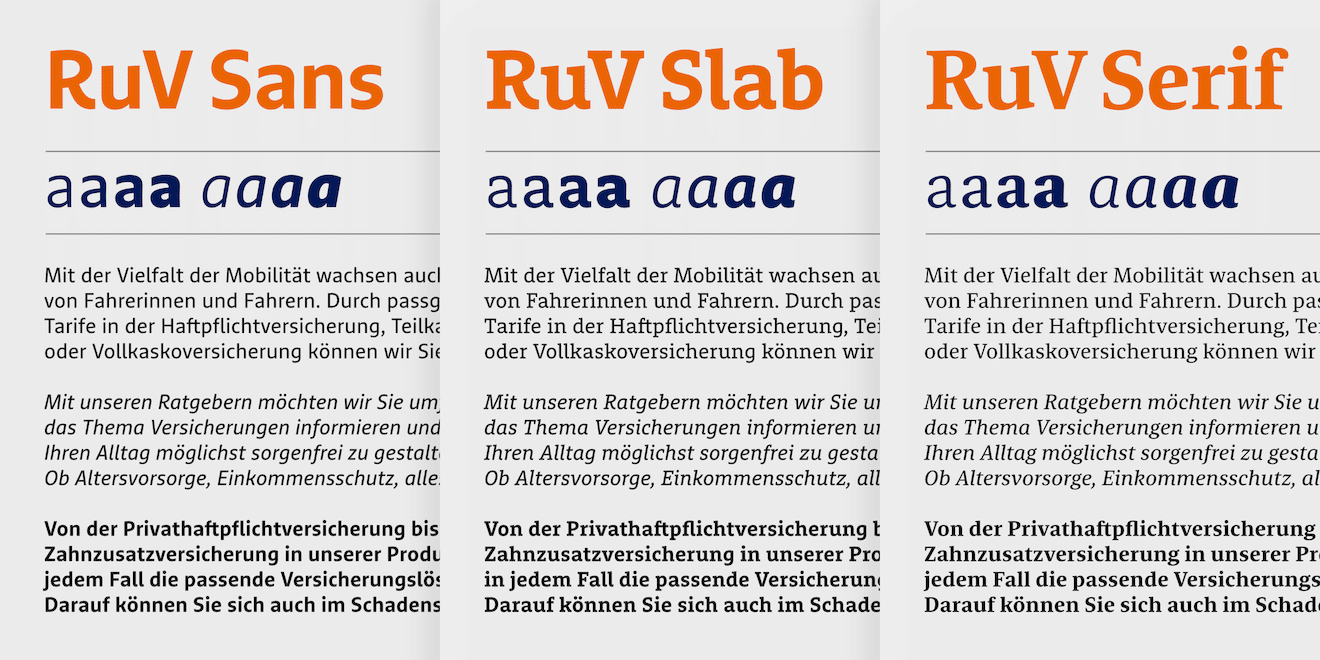
RuV Type is the new corporate type family of R+V Insurance. Together with Ivo Gabrowitsch, Managing Director of Fontwerk, and in close collaboration with the R+V corporate design team, I designed and developed the typefaces between 2024 and 2025.
With over 9 million customers, R+V is one of Germany’s largest insurance companies. Rooted in the spirit of cooperative partnership, it offers private and corporate clients a broad range of financial and insurance services.
To enable more flexible use of its corporate font in the future, R+V decided to switch to an exclusive corporate typeface and thus replace the previously used FF Marselis. This went hand in hand with the desire for a contemporary technical performance, barrier-free usability and a design that gently evolves the R+V brand.
Narrow down the specs
The R+V team had a fairly clear idea of the scope of the new typeface: it was to be an extensive family consisting of a Sans, a Slab, and a Serif, each in four weights with matching italics. These 24 fonts were to be made available as static font files and as variable fonts.
While the technical scope of such projects is fairly easy to predict, the same doesn’t go for the design requirements. A design that “aligns with R+V Versicherung’s overall brand positioning” is difficult to describe or visualize at the beginning. How does R+V position itself, and what formal characteristics can be derived from that?
To clarify these questions, we held a workshop with R+V’s internal brand and design team. During the workshop, we defined design criteria that reflect R+V’s brand values — inspiring, cooperative, and solid — which would serve as the foundation for the new typeface.
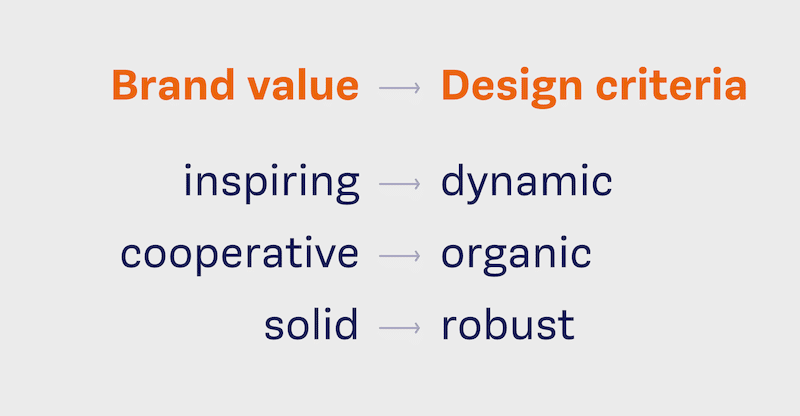
To make things even clearer for ourselves, we also defined characteristics that the new design should explicitly avoid. We ended up with a typeface that was meant to be dynamic (not generic), organic (not geometric), and robust (not fragile).
Concept
Armed with these guidelines, we began to develop initial ideas. Pen and paper always come first – they allow for a spontaneous and immediate visualization of ideas without the rigid grid and precision of digital devices.
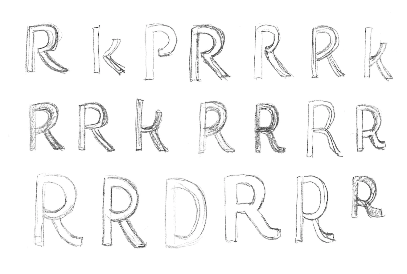
We started by focusing on the Sans, as it was intended to become the core member of the R+V typeface family. The world of sans-serif typefaces includes a wealth of different styles. Apart from a trendy Grotesk, we didn’t want to rule out any particular style from the beginning. So we suggested four designs to the R+V team, with the working titles »Antwerpen«, »Hamburg«, »Den Haag« and »Brighton«.
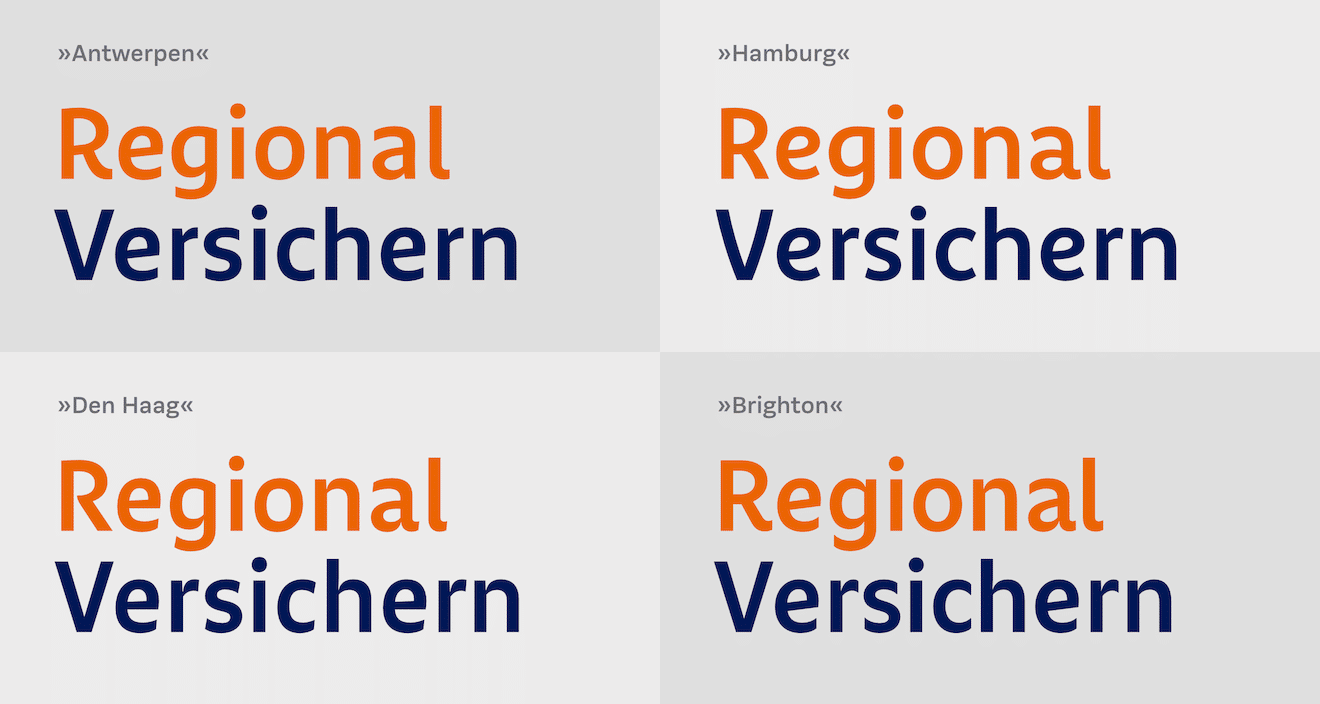
The names of the drafts refer to the regions where the styles have their local origins. For example, “Den Haag” is based on the Dutch school with its handwritten influence, whereas “Brighton” refers to the English Grotesque model. All designs differ in the distribution of stroke weight contrast, the openness of the counters, the richness of detail, and the overall visual impression. What they have in common is a similar letter width (and thus a similar character spacing) and an elaborate R, which plays a style-defining role in the R+V brand name.
For us, the “Antwerpen” and “Den Haag” were the most promising designs and best met the specifications. We were therefore delighted when the R+V team opted for “Antwerpen”.
We were impressed by the font and, in our assessment, found it to be extremely strong in terms of robustness, confidence and balance.
Natalie Bauer, R+V Corporate Design Manager
And so the direction was set. We bid farewell to the working title “Antwerpen” and renamed the font RuV Sans. From there, we began to further refine the glyphs.
Details
RuV Sans is modern, lively, and open. It features subtle details that lend the typeface a sense of vitality. Most striking are the slanted bars in R a and e, which cause the letters to lean slightly to the right. This is emphasized by the angled strokes at x-height and the ascenders. The R+V team called this effect Aufstrebende Dynamik™ (Upward momentum) – a term that guided us throughout the entire design process.
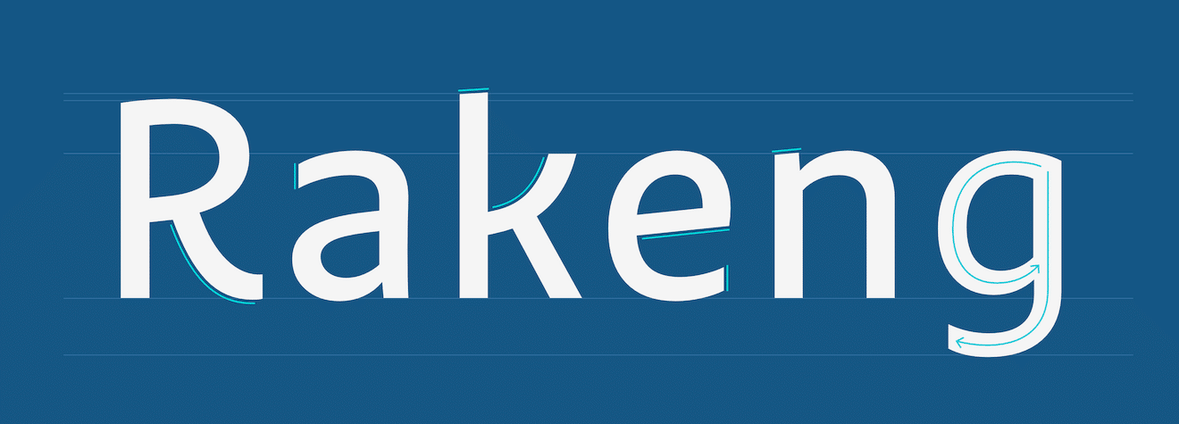
The structure of RuV Sans is clearly derived from handwriting. This is particularly evident in the curves of the letters b and g, which lend it an intrinsic warmth. Some diagonals are strongly curved, making the R a particularly distinctive character.
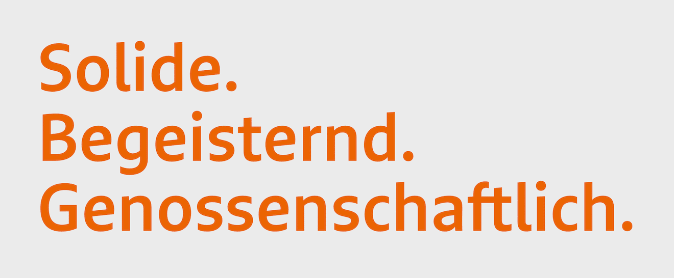
Getting the tone right and matching the font’s appearance to R+V’s values was our top priority. As the project progressed and more glyphs, weights, and styles were added, we were able to continually check our results against the previously defined specifications.
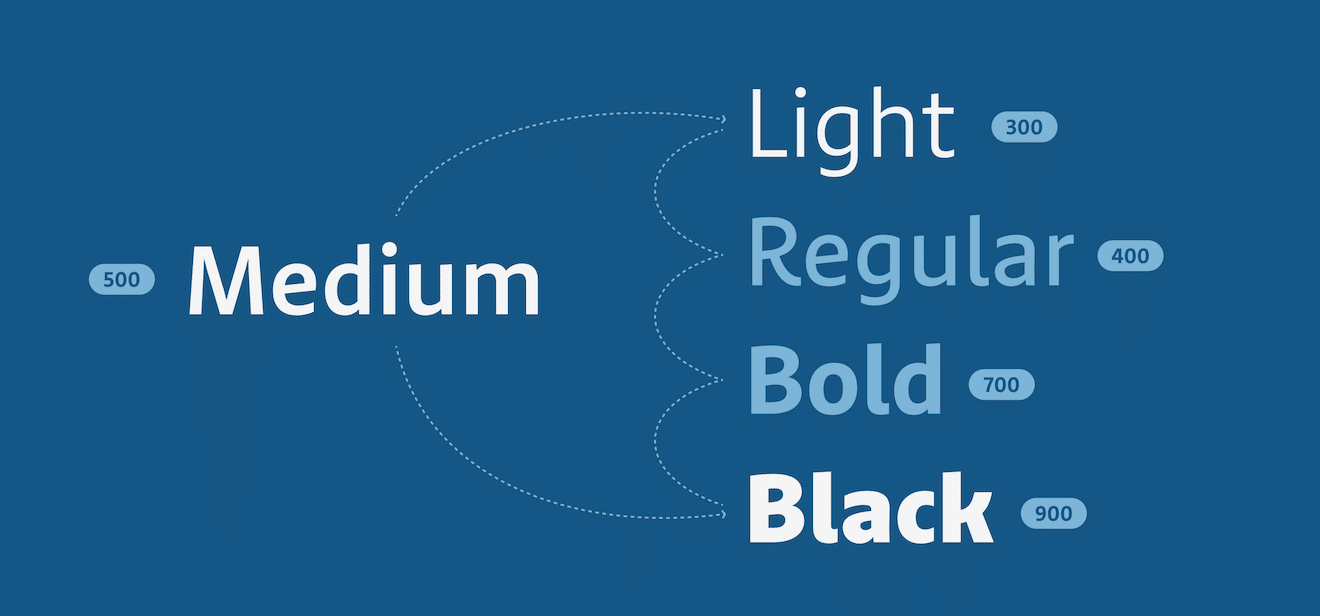
Up to this point, we had only worked on the Medium weight. This has the advantage that the characters are still relatively light, but there is enough flesh to clearly work out the distribution of stroke weight contrast. Once we were reasonably satisfied with the curves, we began expanding the weights. Based on the Medium, we drew a Light and a Black, and then derived the intermediate steps Regular and Bold. Now we were able to test the typeface across its entire range and make further adjustments.
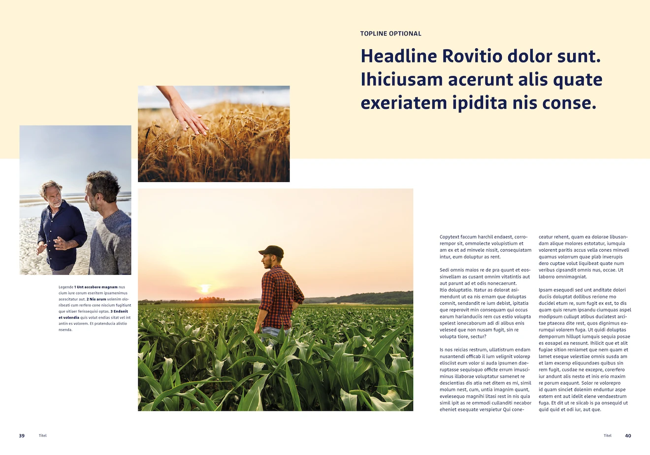
Now that we had the full range available, we were able to test extensively — R+V provided us with real templates for this purpose. Nothing demonstrates a font’s qualities more clearly or exposes its weaknesses more ruthlessly than using it in real-world applications.
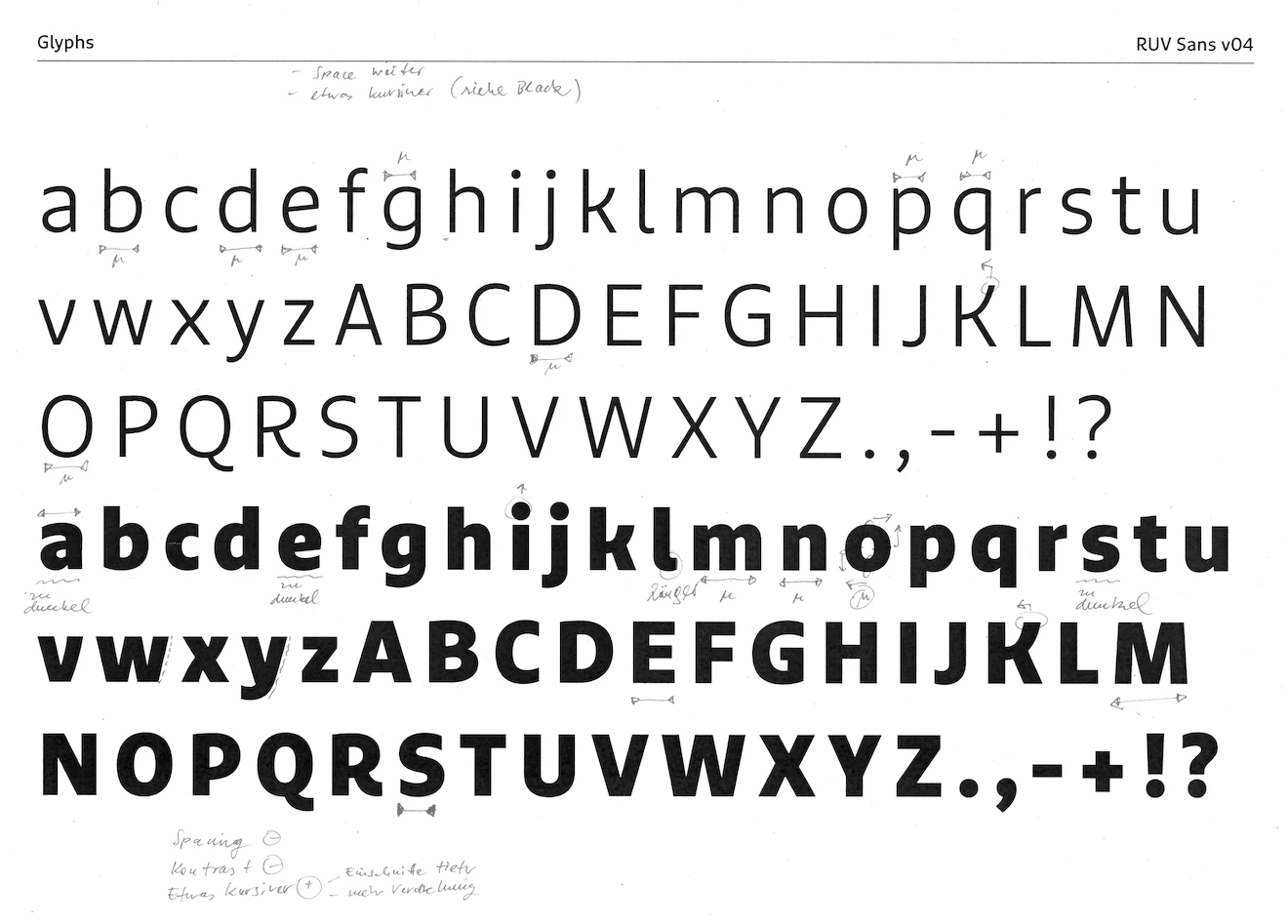
Through a process of repeated testing, revising, testing, and revising, we have further refined the typeface and expanded the character set bit by bit.
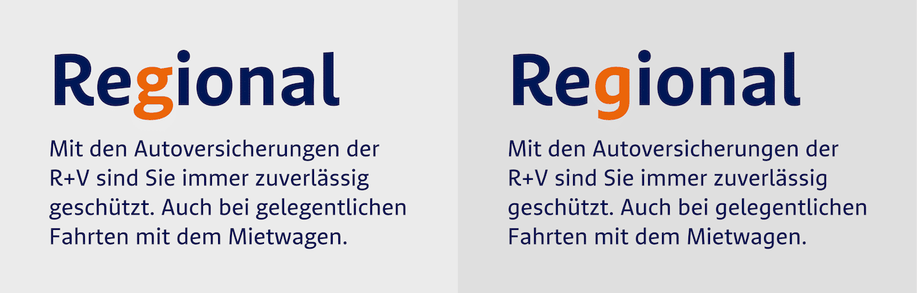
Type designers love the double-storey g – at least, I certainly do. Unlike the single-story version, it offers so many more possibilities for adding something distinctive to a typeface. In the case of RuV Sans, it would emphasize the upward momentum even more. The R+V team decided against it and voted for the single-story g. Not least because the previous typeface, Marselis, also included such a variant and the change seemed too daring after all.
One important aspect we had to keep in mind was the letter spacing. The goal was to cause as few text breaks as possible when replacing the old fonts with the new ones. This required careful adjustment of glyph shapes, glyph widths, and kerning. And although the letter spacing of the two fonts does not match 100%, we were able to reduce text reflow to a minimum.
Expansion
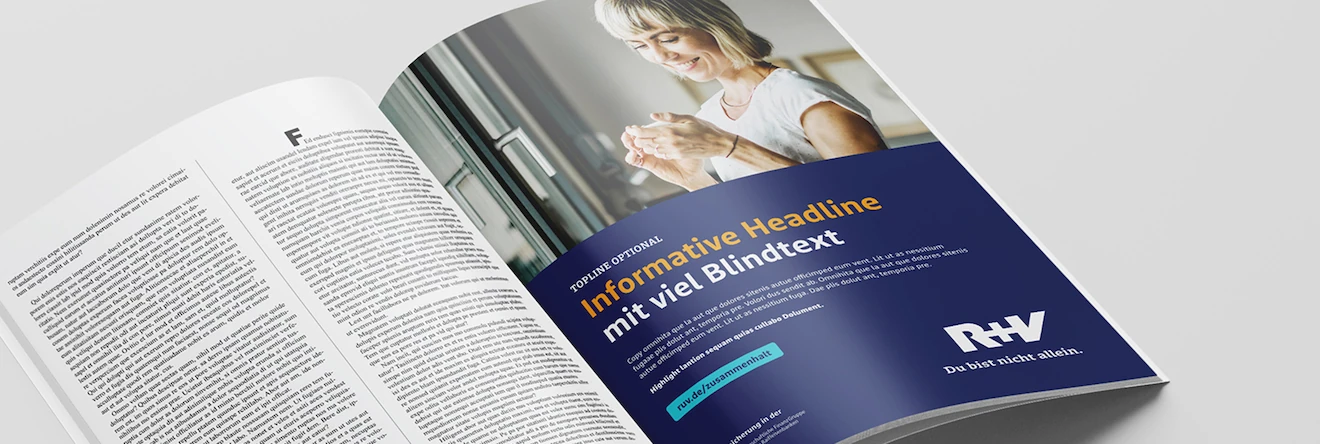
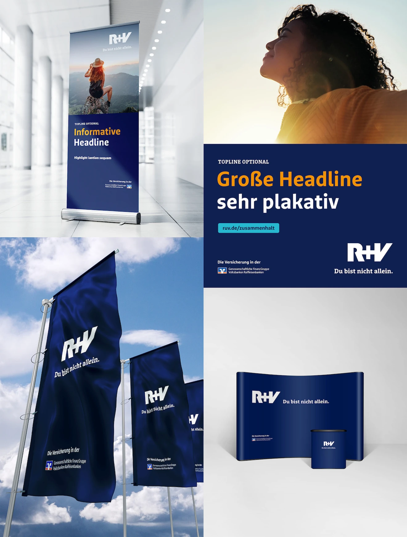
The second module in the R+V brand typography is RuV Slab. It serves as a secondary font for headings, call-to-action elements, and short, highlighted passages of text. It follows the design pattern of RuV Sans – dynamic, open and clear shapes – but appears more striking and stable. As a headline font, it is often set in uppercase, which allows its bold serifs to come into their own.
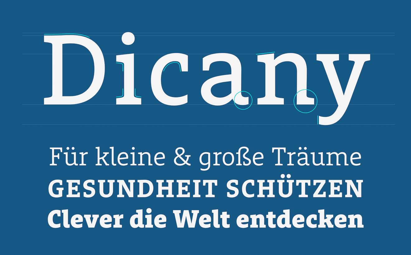
We also tested the Slab extensively in real templates. Since it is a display typeface, it is rarely used on its own without the Sans version. Therefore, it was crucial that the two complement each other perfectly in terms of stroke weight, letter spacing, and style.
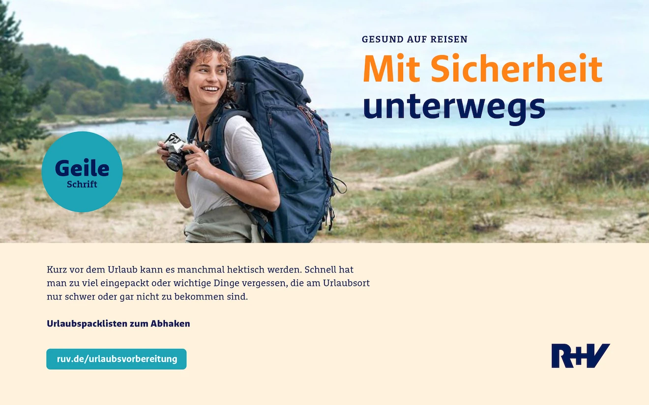
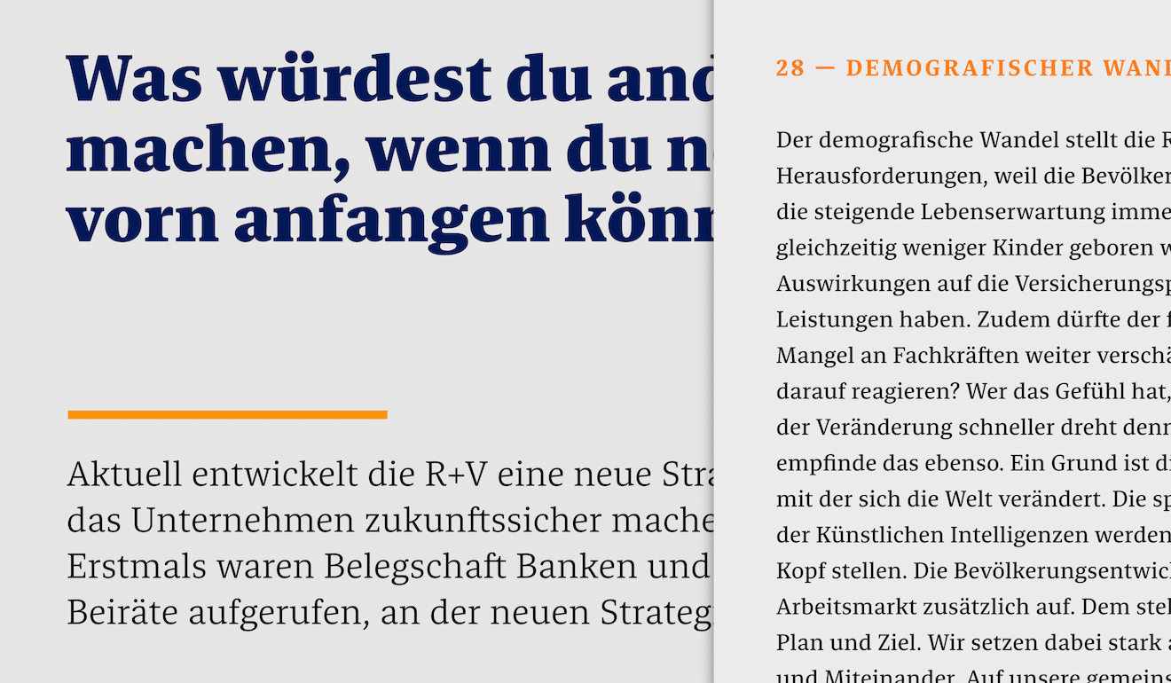
As Sans and Slab were already well-developed, we were able to turn our attention to RuV Serif. It is not deeply rooted in the R+V design system, but is currently used primarily in internal publications. This gave us a little more freedom in its development and allowed us to revive our good old friend, the double-storey g!
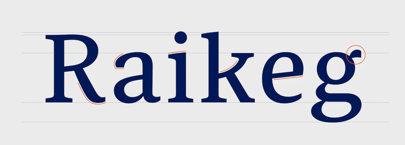
Of course, RuV Serif is integrated into the design language of the other variants. It also features slanted crossbars and strongly curved diagonals (R + k). We decided to give it a subtle magazine-style look, as evidenced, for example, by the subtle drop serifs on a and g.
Last but not least: Italics
The final chapter in this long project was devoted to italics. Once the design of the upright fonts had reached its final stage, we turned our attention to the italic styles, which are intended for gentle emphasis in continuous text.
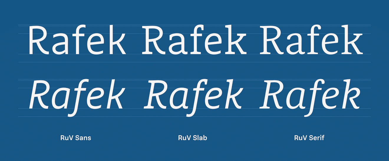
In keeping with a humanistic font family, we did not simply added slanted letters, but we draw true italics – with different shapes for a e f and k. These and many other details allowed us to further enhance the handwritten character.
The project took a total of 14 months to complete, and I am very grateful to have been a part of it. Despite the enormous effort involved, it was always enjoyable, inspiring and focus-driven, thanks to the trusting collaboration with the R+V team and, of course, with Ivo Gabrowitsch from Fontwerk.
RuV Type in use