Freihzeit
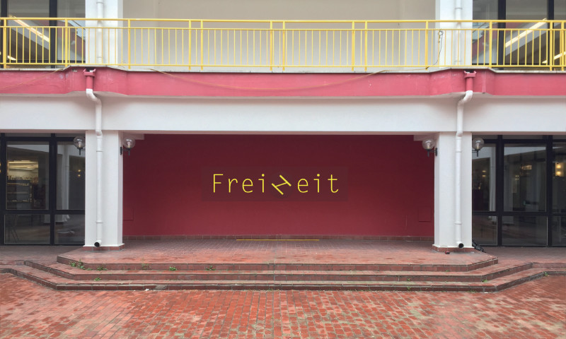
In 2018, artist Ricarda Mieth was planning an installation for the Freizeitforum Marzahn, a cultural and sports centre in the north of Berlin. Ricarda wanted to install a LED illuminated lettering on the facade in the inner courtyard. It would have a modified H that would become a Z when rotated by 45°. Through a steady, slow rotation of this letter combination, the words “Freizeit” (meaning “leisure” in German) and “Freiheit” (meaning “freedom”) were to appear alternately. Ricarda asked me to help her in finding a suitable typeface.
In her first draft, she used Letter Gothic and a modified H/Z. We agreed that the open rhythm of a monospaced typeface would fit well into the architecture, but Letter Gothic seemed a bit too aged and old-fashioned. After searching unsuccessfully for suitable alternatives, we decided to draw the lettering ourselves. This would give us full control over the appearance and also the stroke thickness, allowing us to provide the dimensions suitable for the illuminated letters.

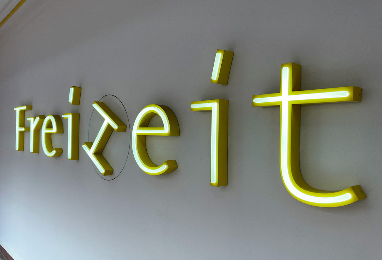
I redrew the letters, making them more open and monolinear. The combination H/Z has small extensions at the ends of the stems to make the H more recognizable. To better integrate these peculiar elements into the lettering, I adapted them as serifs for the letters F, r and i.

While for nonlinear letters the i-dot must always be slightly thicker than the stem, this is not possible for monolinear letters. Therefore, the i-dot became an i-stroke with the same stem thickness. I added a subtle slant to echo the rotation of H/Z.

Finally, we had three variants to choose from to give the right tone. The first had soft curves and bows, which fitted well with the lively terms “leisure” and “freedom”. The second variant was very geometric. It has additional serifs at the bottom and blends neatly with the straightness of the surrounding architecture. In the end, Ricarda chose option 3 (a mixture of 1 and 2), especially because the H/Z was visually well integrated.

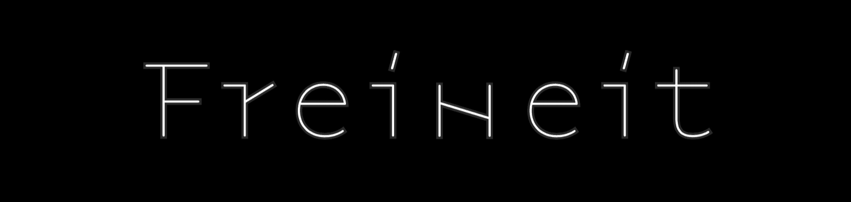
It took us many attempts to find the right angle for the middle stroke of the H/Z. Both letters, H and Z, had to be as recognisable as possible on their own. We found that the legibility of one letter dropped when the legibility of the other improved. So we decided that an angle of 17° was the best compromise. It turned out that many people read “Freineit” instead of “Freiheit” at first glance, but quickly understood the twist due to the letter rotation.
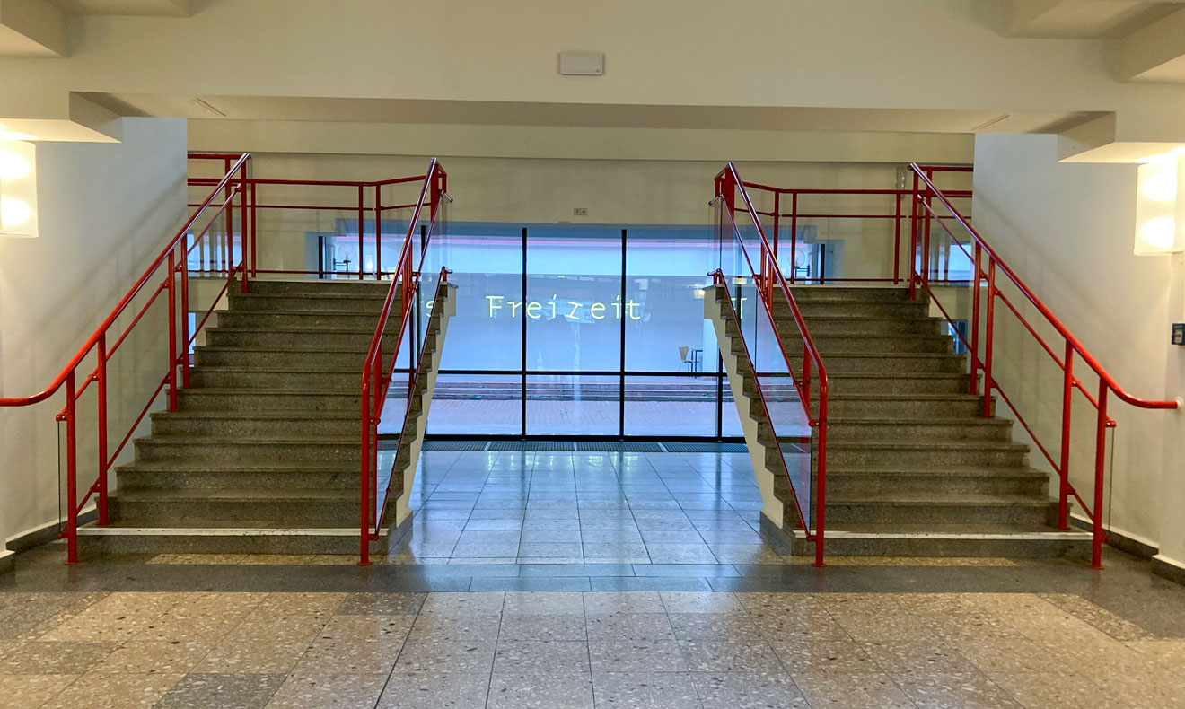
Based on our design, white illuminated LED letters with a rotating section were produced. The entire installation was integrated into a facade in the courtyard of the Freizeitforum Marzahn and presented to the public in October 2019.