Don Gelati

Don Gelati is a small, family-run company with Sicilian roots, dedicated to the creation of traditional ice cream, coffee and pastry specialties. A few years ago, the Don Gelati brand was created specifically for this purpose by Heller & C., a branding agency based in Cologne, Germany.

The lovely folks from Heller & C. drew a heraldic looking lion with an accented tongue. To my delight, they set the brand name in my typeface CamingoDos. I was tasked with optimizing the designs for curve quality and typographic tidiness.

I started with the logo, which stands dark on a white background. The lion was already pretty well drawn, but after a detailed look, I spotted a few mismatches. The lion’s tongue seemed less organically flowing, more like a candy cane slipping out of its mouth. The three strands in the mane looked like wet hair, and I spotted a few kinks on the back and tail. The letter spacing was also not optimal. It was too narrow in some places, too wide in others, and the word space could be a little larger.
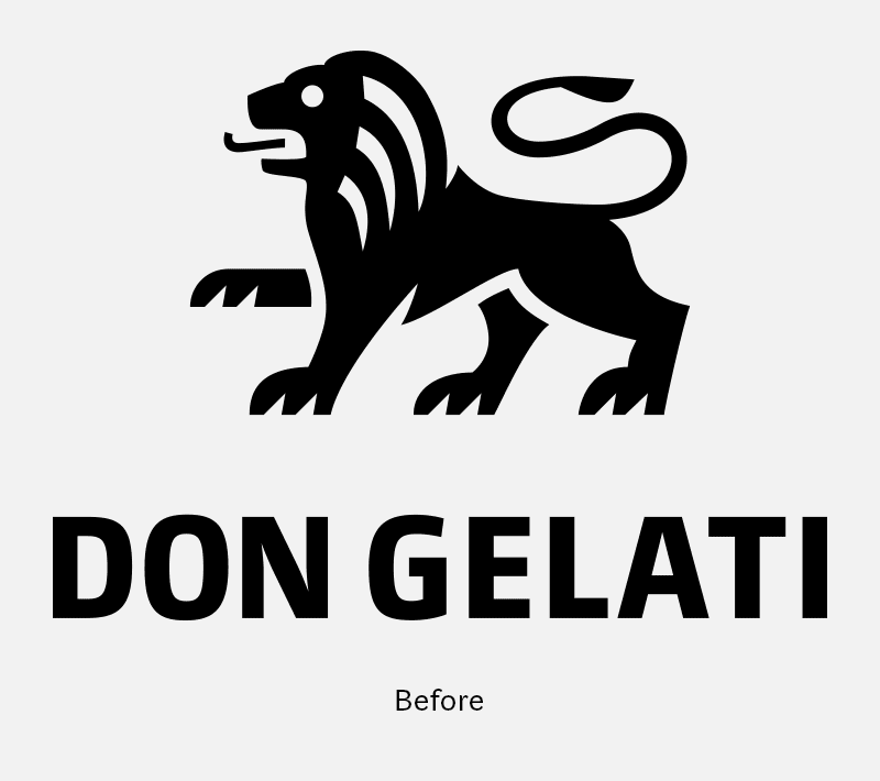
I gave the lion a new tongue that looks more like it’s licking ice cream. Furthermore, I smoothed the curves of the strands, back and tail. The word mark has become a touch bolder overall. I widened the letters D and G a bit, whereas N, E and L became a bit narrower. This gave room for a more harmonious spacing.

If the logo was set inverted on a dark background, the light shapes overshone the dark ones. The lion looked thicker and chubbier, its eyes and strands were too thin, and even the word mark was chunky and seemed to need more space. To compensate for this, I thinned out the lion completely, so the light areas became smaller. The entire word mark became less heavy and considerably narrower. This gave the whole logo more lightness, and it looks good even in small sizes.

Last but not least, I optimized the inverted brand name without changing the inner left or right margins. All the characters became slightly wider, especially D, G and E. This allowed the letter spacing to be more compact and the gap between the two words to be clearer.

All in all, there were a lot of many small changes. But they were necessary to give the brand precision and balance and improve its recognizability.